Tired of the “builder’s beige”? How to Avoid Colour Mistakes in Your Home Renovation
- Emma Merry Styling

- Jul 27, 2025
- 5 min read
Updated: Feb 25

How to Avoid Colour Mistakes in Your Home Renovation
So, you’ve decided it’s finally time to give your home a glow up. Maybe the kids are no longer toddlers with sticky hands or maybe you’re just tired of the “builder’s beige” that’s been hanging around since 2008. Either way welcome to the world of home renovation. It’s exciting, it’s creative, and… it’s slightly terrifying.
One of the first questions I get from clients , usually with a hint of panic is:“How do I choose the right colours without losing my mind (or my money)?”
I get it. Deciding on paint colours can feel like entering a relationship exciting at first, then deeply confusing, full of mixed signals, and occasionally ending in tears. But it doesn’t have to be that way.
Here are some of the biggest colour traps I see all the time and my real-life advice for avoiding them. Spoiler: you can have a stylish, feel-good home without it becoming an Instagram cliché.
1. Skipping the tester pot Stage (a.k.a. Colour Catfishing)
You wouldn’t buy a car without test driving it, right? So why are we committing to a £50 tin of paint after seeing it under fluorescent shop lighting?
It’s tempting to go from swatch to full wall in one leap especially if you’re busy, or just over it. But this is a recipe for disaster (or at least some very passive-aggressive sighing every time you walk past your tooyellow hallway).
Pro tip: Use large sheets of lining paper or thick card for your samples. Move them around the room like you’re on a colour safari. Morning sun? Check. Rainy Tuesday? Check. Evening Netflix light? Big check.Take your time, let the colours hang out with you How do they feel?


2 . Underestimating the Power of Light (Like, It’s Giving Optical Illusions)
Light is basically that friend who turns up at different times of day and gives wildly different energy. A colour that looked moody and mysterious in the evening? Suddenly feels like a sad beige in morning light.
My suggestion is to test your colours in the actual room and on vertical surfaces. Lighting changes everything — and if you don’t believe me, ask anyone who’s ever ordered something off Instagram and then wondered why it looks completely different in real life.
Observe your samples like you’re on a reality show judging panel: morning, midday, night, see who stays in the competition
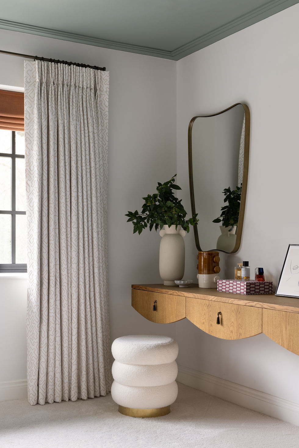
3. Ignoring the ceiling aka the Fifth Wall (The Ceiling Is Not Just There to Hold Up Cobwebs)
Ok so the builder suggested that these be finished in white? You painted your walls a gorgeous, earthy green, but the room still feels… off. That bright white ceiling? Yeah, it’s kind of crashing the party.
We’ve all defaulted to brilliant white ceilings because it’s what we’ve been told is “safe.” But sometimes safe just equals bland. Try painting your ceiling a slightly softer version of your wall colour or even a bold contrast if you’re feeling brave. Honestly, it’s the interior design version of upgrading from trainers to boots, suddenly the whole outfit (er, room) makes sense.
4 . Playing It Too Safe (Beige Is Not a Personality, Bestie)
There’s nothing wrong with neutrals however, if your home feels more “waiting room” than “warm retreat,” it might be time to step outside your comfort zone. I meet so many clients who played it safe for years and are now ready for colour that actually sparks joy.
I travel a lot and inspiration is everywhere. That moody navy blue from your favourite coffee shop, The peachy pink you saw on a wall in Mallorca, Take those moments and turn them into paint swatches. If you’re still unsure, working with the team at Emma Merry Styling can help you gently level up your confidence and avoid turning your hallway into a pastel regret.

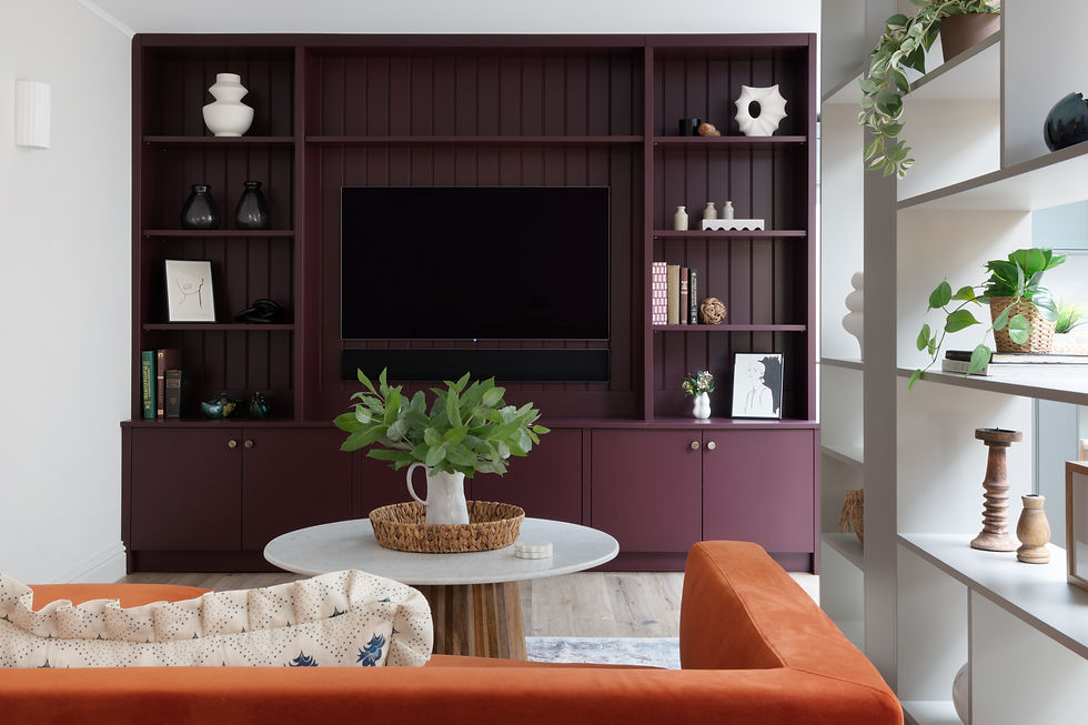
5. Choosing Paint Like It’s an Island
We often treat paint like it’s the magical fix that’ll tie the room together. Sadly that’s not always the case, Colour only works when its been considered as part of a cohesive scheme, like flooring, your sofa, that weirdly bright rug your partner insists on keeping.
So before you fall in love with a sage green, make sure it vibes with your oak dining table and that vintage armchair that somehow made it through three house moves.
6. Overthinking the Colour Wheel (Or Just Ignoring It Entirely)
Colour theory can be helpful but it’s not gospel. Think of the colour wheel as your friendly tour guide, not the strict parent. Want to pair blush pink with burnt orange? Do it. Soft greens with navy? Yes please.
There are tools online (Adobe’s free colour wheel is fab) that help you see combos you wouldn’t normally try. But at the end of the day? If you love it, it works. The only real rule? Don’t second-guess yourself into painting everything magnolia again.
Final Thoughts: You’ve Got This
Renovating your home especially one with history and character like many of the beautiful 1940s properties here in Surrey should feel personal, not panic inducing. With a little patience, a few big sample sheets, and a healthy dose of curiosity, you’ll be surprised at how confident you can become with colour.
And if you ever need someone to decode the undertones, explain why your “calming grey” looks suspiciously purple, or just talk you down from a 3am paint sample meltdown, you know where to find me. 💬
Need a second opinion I offer design consultations designed for real homes, real families, and real lighting. Let’s make your home feel like you but with better lighting.
Interior Design & Bathroom Design Services Across Surrey, Sussex & South London
Emma Merry Styling is an interior design studio specialising in luxury bathroom design, interior architecture and full home renovations across Surrey, Sussex, South London and the Home Counties. We regularly work with homeowners in Reigate, Cobham, Guildford, Weybridge, Oxshott, Wimbledon, Richmond, Esher, Dorking, Farnham and surrounding areas, supporting clients through considered, floor-by-floor home renovations as well as complete property refurbishments.
Our studio works closely with architects, builders and specialist craftspeople to design bespoke bathrooms, custom vanity units, master suites and family homes that balance practicality with timeless design. From early spatial planning through to final interior styling, our approach focuses on creating cohesive interiors that evolve naturally with the architecture of the home, ensuring every renovation stage contributes to a unified and enduring result.


Comments